culture
Mimiquate's New Look and Blog
After eight years of growth and evolution, we’re thrilled to unveil a fresh look for our brand, along with an updated website and a brand-new blog.

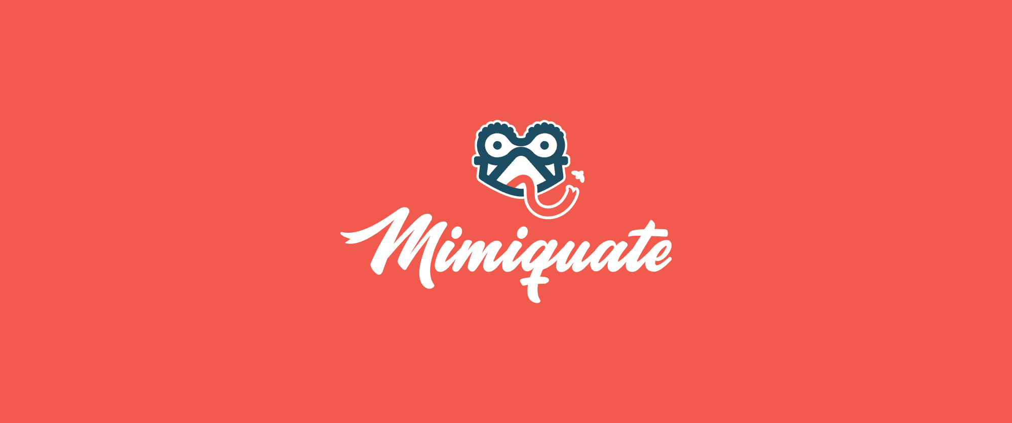
After eight years of growth and evolution, we’re thrilled to unveil a fresh look for our brand, along with an updated website and a brand-new blog. This rebranding marks a key milestone in Mimiquate’s journey, helping us better communicate who we are today and share more about what excites us—especially the projects and events we’re involved in.
A Look Back at Our First Brand
When Marcelo and I first founded Mimiquate, it was just the two of us. Our goal back then was simple: create a brand that looked great online and could be easily shown to potential clients as we traveled to conferences. It was essential that the brand reflected our commitment to adapting to our clients’ needs—something we still prioritize today.
One of the things we loved most was our original mascot, the chameleon. It wasn’t just a fun symbol; it represented our core value—adaptability to our clients. Just like a chameleon changes its colors to fit its environment, we prided ourselves on being flexible and responsive to the challenges and requirements our clients presented. However, as time passed, we realized that while the mascot worked well digitally, it became tricky to use in other formats like print. Logos were more complex back then, but the industry has since shifted towards simplicity.
We took a practical approach to our first website, too. Using a $20 template from an online gallery, we customized it to fit our needs. At the time, it was the perfect solution: affordable, quick, and functional, with a fantastic return on investment for our young company.
Why Rebrand Now?
As Mimiquate grew, balancing branding with the demands of the business became more difficult. Both Marcelo and I were coding full-time, so naturally, marketing efforts took a back seat. Now, eight years later, with a team of 30, we finally have the opportunity to focus more strategically on enhancing the company’s image.
Our original brand started to feel outdated, especially with the industry trend toward cleaner, more modern designs. What once symbolized our adaptability began to feel too complex. So, we knew it was time for a refresh.
A Collaborative Redesign
For this redesign, we chose to work with the creators of our original brand, Barbudo Estudio, because of the great experience we had with them before. This time, we wanted a more modern, approachable look that reflects our growth while staying true to our core values.
A key difference with this rebrand is that we involved our entire team in the process. As Mimiquate has expanded, we felt it was important for the brand to represent all of us, not just the founders. The result is a fresh, unified look that we’re all proud to share.
A New Website and Blog
Our rebranding didn’t stop at just the logo. We also set out to completely redesign our website to better showcase who we are today and the work we do. To bring this vision to life, we teamed up with our friends at Purple Bunny, who handled everything from design to copy and implementation.
One of the most exciting aspects of the new website is the launch of our blog. We’ll use this space to dive into technical content, share updates on the events we organize and sponsor—including the Elixir Montevideo meetup—and talk about other company-related initiatives. We’re excited to connect with our community in a more personal way through these posts.
